Kompak: A Playful Display Font for Digital Design
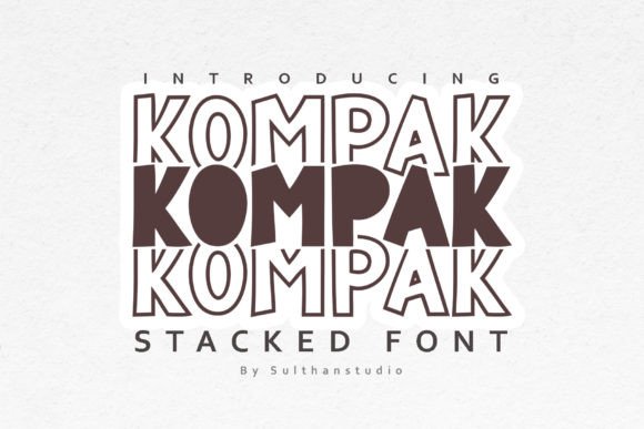
As a web designer who ships landing pages, SaaS dashboards, and boutique e-commerce sites, I look for typefaces that do more than look good—they need to function in context. Kompak stands out not because it’s trendy, but because its stacked letterforms and bold, rounded characters create immediate visual rhythm without sacrificing clarity. It’s a display font built for digital impact: friendly but intentional, expressive but legible at scale.
Kompak isn’t meant for paragraphs or data tables. Its strength lies in commanding attention—where users land, where they pause, and where they decide to act. The vertical stacking of letters adds subtle depth and motion, making headlines feel dynamic even on static screens. That playful energy translates directly into brand tone: think creative agencies, indie course platforms, wellness brands, or children’s learning apps—not corporate law firms or enterprise analytics tools. It signals approachability, curiosity, and human-centered design.
In hero sections, Kompak works best at 48px and up on desktop, with generous line-height (1.2–1.3) to preserve the openness of its rounded forms. On mobile, I cap it at 36px with tighter tracking to avoid crowding. It performs exceptionally well over high-contrast backgrounds—especially light text on dark gradients or bold color blocks—because its thick strokes and clean terminals resist pixelation. When layered over imagery, I always apply a subtle text shadow (1px black at 30% opacity) or use a semi-transparent overlay behind the text block. Never rely on Kompak alone for body copy; its personality is too strong for extended reading.
For conversion-focused layouts, I reserve Kompak for primary CTAs only when the button label is short: “Get Started”, “Join Now”, “Try Free”. Longer labels like “Download Your Complete Brand Kit” lose scannability. Instead, I pair it with a neutral sans serif—like Inter, Poppins, or Manrope—for supporting text. That contrast builds hierarchy naturally: Kompak says *“this matters”*, while the sans serif says *“here’s why”*. This pairing also reinforces trust—playful without being unserious, distinctive without sacrificing professionalism.
Kompak shines in specific digital contexts:
- Creative portfolios: Use it for project titles overlaid on case study thumbnails—its stacked structure creates visual anchors that guide the eye across grid layouts.
- Boutique online stores: Apply it to limited-edition banner headers (“Summer Drop Live”) or seasonal collection names—its warmth encourages emotional connection before the first product scroll.
- Coaching and course sales pages: Deploy it in section headers like “What You’ll Master” or “Your Journey Starts Here”—the rounded shapes soften the transactional feel of pricing tables and enrollment steps.
- Blog headers and social graphics: Scale it down to 28–32px for featured post titles in newsletter banners or Instagram carousels—its distinct silhouette increases recognition across platforms.
Readability on small screens demands intentionality. On mobile buttons, I avoid Kompak entirely below 24px—it loses character definition. For responsive navigation menus or tab labels, stick to your system font. But for hero headlines on mobile? Yes—just ensure letter-spacing is increased by +20–30 units to prevent visual merging, especially with stacked ‘n’, ‘m’, or ‘w’ glyphs.
Font pairing is where Kompak reveals its versatility. With a clean sans serif (Inter, Work Sans, or Montserrat), it grounds energetic branding in usability. With a low-contrast serif (Cormorant Garamond or Literata), it adds editorial sophistication—ideal for digital magazines or premium content platforms. Avoid pairing it with other display fonts, script fonts, or decorative serifs; the contrast would dilute its purpose. Think of Kompak as the lead vocalist—it needs a steady rhythm section, not another soloist.
Before licensing, check what’s included: most Kompak variants ship with regular and bold weights, basic Latin character sets, and OpenType features like stylistic alternates. If your audience includes Spanish, French, or German speakers, verify diacritic support—some versions include accented characters, others require extended licenses. Webfont formats matter too: WOFF2 is essential for performance, and variable font options (if available) give you fine-grained control over weight and width in CSS.
Licensing is non-negotiable. Kompak is a premium font—you’ll need a commercial license for any public-facing use: websites, client projects, Shopify themes, Notion templates, Figma UI kits, or branded email campaigns. Free trials often restrict usage to mockups only; live deployment requires proper licensing. When building reusable design assets—like a brand kit for a client or a template sold on Creative Market—confirm whether the license covers redistribution. Skipping this step risks legal exposure and undermines the craft of type design itself.
Kompak doesn’t try to be everything. It’s not a system font. It won’t replace your body typeface. But when you need a voice that’s unmistakably warm, confidently modern, and digitally resilient—it delivers. In a landscape crowded with generic sans serifs and overused scripts, Kompak offers something rare: personality with precision. Use it where tone matters most, pair it with restraint, and let its stacked rhythm do the work of drawing attention, building identity, and guiding action—all without saying a word.